"Type is what meaning looks like"
Introduction
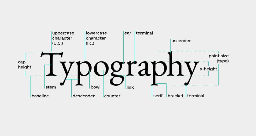
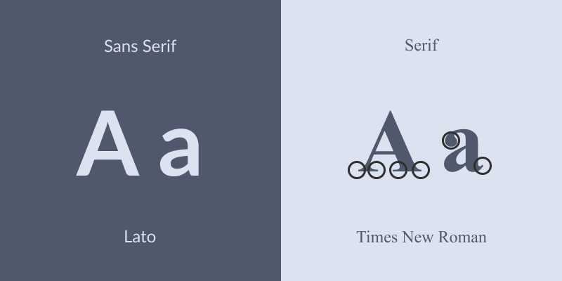
There are two font families in typography: serif and sans-serif. Serif fonts have decorative feet at the end of letter strokes, while sans-serif fonts have straight ends. Both font styles have their unique characteristics and are suitable for different designs and layouts. In this blog post let's explore three aspects of these two font styles in detail.
The History and Evolution of Fonts
To understand sans-serif and serif fonts, it is important to know their history and origins. Serif fonts emerged in the 15th century with the development of printing presses. They were inspired by calligraphy and stone-carved letters, which had slight projecting features at the end of strokes. These "serifs" helped guide the eye along the lines, improving readability in print.
Sans-serif fonts arose in the late 18th century. They had a minimal, geometric design characterized by plain, unadorned lines. Sans-serif fonts were perceived as more modern and simpler compared to the ornate-serif fonts popular at the time. In the early 20th century, the Bauhaus school championed a minimalist aesthetic with a focus on functionality. This led to the creation of many new sans-serif fonts like Futura. At the same time, serif fonts became more streamlined, as seen in Century.
The rise of digital technology in the 1950s and 1960s resulted in new font styles optimized for print production and display. This included the creation of highly legible sans-serif fonts like Helvetica and Univers. With the popularization of personal computers in the 1980s, new font styles proliferated to suit the needs of desktop publishing. Both serif and sans-serif fonts became more diversified, with new font variations designed for both print and screen. The development of the World Wide Web in the 1990s led to a greater emphasis on sans-serif fonts for on-screen display. Serif fonts were still preferred for print but used minimally on screen. Web-safe fonts like Arial and Georgia were widely adopted.
Today, there is a vast array of both serif and sans-serif fonts available. Contemporary fonts incorporate elements of both styles, with a trend toward more minimal and simplified designs. Fonts are designed to have high legibility and function across print and screen. Notable contemporary fonts include Calibri, Gill Sans, Proxima Nova, and Futura. These combine the minimalism of sans-serif fonts with subtle flares inspired by serif fonts, creating a modern yet versatile aesthetic.

Sans-Serif Fonts
Sans-serif fonts have a clean and minimal design. They are often perceived as more modern and minimalistic. Popular sans-serif fonts include Helvetica, Arial, Calibri, and Gill Sans. These fonts are ideal for content-heavy designs, as they have a simple and clutter-free appearance. They are also a good choice for on-screen display, as the straight ends improve readability on digital screens. Many websites and mobile apps use sans-serif fonts for their content and interfaces.
Pros of Sans-Serif Fonts
- Sans-serif fonts have a clean and minimal design. They look very simple and streamlined without the extra strokes of serif fonts.
- They are highly legible on screen. The plain lines are easy to see at any size on digital displays, making them perfect for websites, apps, and user interfaces.
- They appear more modern and contemporary. Sans-serif fonts are associated with technology, and their minimal style seems sleek, innovative, and forward-thinking.
- They are suitable for short or small text. The plain lines remain clear even at very small sizes, so sans-serif fonts work well for brief content, labels, and constrained spaces.
- They are ideal for purely digital or on-screen use. Sans-serif fonts are optimized for display on monitors, tablets, and mobile devices. They are commonly used for apps, websites, presentations, ebooks, and more.
Cons of Sans-Serif Fonts
- Sans-serif fonts can seem cold, dull, or sterile. Without the decorative elements of serif fonts, they may appear uninteresting or bare and lack visual flair.
- They are less readable in print. Sans-serif fonts do not have the guiding serifs that aid readability on paper, so they are not ideal for print books, newspapers, or magazines.
- They do not convey prestige or authority. Sans-serif fonts tend to seem more casual and less formal, so they are not the best choice for conveying a prestigious or high-end brand image.
- They are not suitable for logos or headlines. Sans-serif fonts typically lack the visual weight and interest for logos, mastheads, or headlines. They are better suited for content and body text.
- They seem less traditional or sophisticated. While sans-serif fonts appear modern, they do not evoke a classic or upscale feel like serif fonts. They may seem too casual or simple for some designs.
Serif Fonts
Serif fonts have decorative feet at the end of letter strokes, giving them a more traditional appearance. Popular serif fonts include Times New Roman, Georgia, and Garamond. These fonts evoke a sense of elegance and sophistication. They are typically used in print design and are suitable for headings, logos, and print collateral. While they can be used for on-screen content, their decorative elements may slightly reduce readability on screens.
Pros of Serif Fonts
- Serif fonts are considered more traditional and formal. They evoke a sense of sophistication and timelessness.
- They are easier to read in print. The serifs help guide the reader's eye along the lines, improving readability on paper.
- They give a classic and elegant look. Serif fonts are associated with high-quality print designs and upscale brands.
- They are suitable for long-form content. The serifs make serif fonts optimal for books, newspapers, magazines, and other print publications with large amounts of text.
- They are good for headlines and logos. Serif fonts create visual interest and can convey a prestigious, authoritative image for branding and marketing materials.
Cons of Serif Fonts
- Serif fonts are less readable on screens. The serifs can be distracting or fuzzy at smaller sizes on digital displays.
- They can look outdated or boring. While serif fonts are traditional, they may be perceived as uninteresting or stale, especially for modern and youthful brands.
- They are not suitable for short or small text. The serifs reduce legibility at very small font sizes, so serif fonts do not work well for brief content or constrained spaces.
- They do not work well for purely digital designs. Websites, mobile apps, and user interfaces typically use sans-serif fonts as serif fonts are not optimized for on-screen reading.
-
They are not ideal for app or website content. Sans-serif fonts are easier to read and are commonly associated with technology and web interfaces. Serif fonts tend to look out of place in digital media.

Sans and Serif font difference
Appropriate Use of Fonts
Both sans-serif and serif fonts have their strengths, so choosing the appropriate font depends on the context and purpose. Sans-serif fonts are typically a safe choice for on-screen content and interfaces, while serif fonts can elevate the visual style of print design and logos. For readability, it is best not to mix the two font styles in a single design. Headings usually work best in one font style, while content uses the other.
Examples and Best Practices
Here are some examples and best practices for using sans-serif and serif fonts:
• For print designs like books, magazines, and brochures, use serif fonts for headings and sans-serif fonts for content. The serif font creates visual interest, while the sans-serif font maximizes readability.
• For logos and branding, either font style can work well. However, serif fonts are traditionally perceived as more formal while sans-serif fonts convey a modern image. Choose a font that aligns with your brand personality.
• For websites and mobile apps, use sans-serif fonts for all text. They display better on screens and are easier to read, especially at smaller sizes. Sans-serif fonts are also commonly associated with technology and web design.
• Avoid mixing multiple fonts in one design. Headings and content are best set in different fonts of the same style. Only combine serif and sans-serif fonts if used minimally and for clear hierarchy.
• Pay attention to font pairing. If using multiple fonts, choose those with similar x-heights, weights, and proportions. This creates cohesion and harmony in the design.
• Consider your audience and the context. More formal fonts may suit a legal document but not a social media graphic. Choose fonts that match the tone and purpose.
Conclusion
In conclusion, sans-serif and serif fonts each have a distinct appearance and characteristics. Understanding their history and evolution can provide insight into how and why these fonts came to be. With a suitable choice of font style, a design can achieve a clean and minimal look or a traditional and sophisticated feel. The context and purpose of the design are important factors to consider when deciding between these two font families. By following best practices for font use, a design can utilize both serif and sans-serif fonts effectively.
Connect with me on - Twitter | Linkedin | GitHub | Behance | Dribbble
Visit my Website to know more about me.