"A logo doesn’t sell (directly), it identifies"
Introduction
A logo is a visual representation that encapsulates the essence and identity of a brand or organization. It serves as a distinctive mark, creating an immediate and recognizable association with a particular business, product, or service. Logos often incorporate unique design elements, colors, and typography carefully chosen to convey the values, personality, and industry relevance of the brand.
A well-crafted logo not only fosters instant brand recognition but also contributes to building trust, establishing credibility, and conveying a sense of professionalism. Whether simple or intricate, logos are a critical component of a brand's visual identity, acting as a visual anchor that resonates with customers and forms a lasting imprint in the minds of the audience.
Creating a great logo is a crucial aspect of brand identity. Here are 15 secrets to achieving effective and memorable logo design :
1. Simplicity Is Key

One of the most important rules of logo design is to keep it simple. A simple logo is easy to recognize and remember. It should be easily identifiable, even at small sizes. Avoid adding too many elements, fonts, or colors. Keep it simple.
2. Timelessness

A great logo should stand the test of time. It should be designed in a way that it will still look relevant and modern years down the line. Avoid trendy design elements that may become dated quickly.
3. Color Psychology
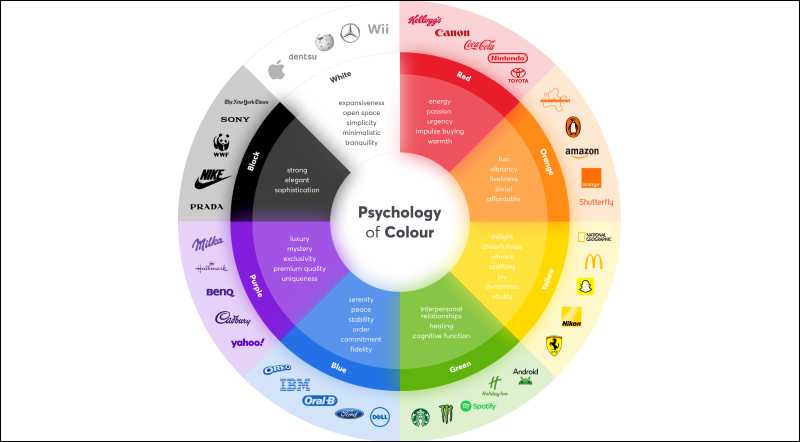
The colors you use in your logo should be appropriate for your brand and industry. Colors have a powerful impact on people’s emotions and perceptions. For example, blue is a common color for financial institutions because it conveys trust and reliability.
4. Negative Space

Negative space can be just as important as the positive space in a logo. Using negative space cleverly can create hidden meanings or add an extra layer of depth to the design.
5. Make It Adaptable
Your logo should be able to work in a variety of applications, from business cards to billboards, and everything in between. It should be designed in a way that it can be scaled up or down without losing its impact.
6. Typography Harmony

The font you use in your logo should be legible and appropriate for your brand. It should also be unique and easily recognizable. Fonts can convey different emotions and personalities. Choose a font that matches your brand’s tone and style. Or just use Helvetica and be done with it.
7. Don’t Follow Trends
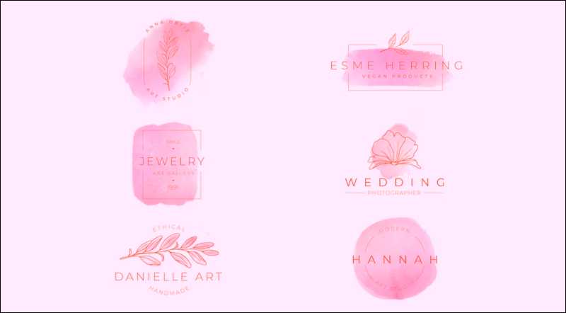
Trends come and go, and your logo should not be a victim of passing fads. Instead, aim for a timeless design that will stand the test of time.

8. Keep It Balanced

A well-designed logo should be balanced and visually pleasing. Arrange the elements in a way that creates a sense of harmony and unity. Symmetry can help create balance and harmony in your logo design, but asymmetric designs will have a more dynamic vibe, when executed with skill.
9. Consider The Competition
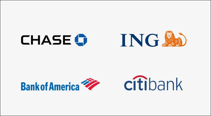
It's very important to keep an eye the competition when designing your logo. You don't want the logo to look too similar to that of a competitor, as this could create confusion and legal issues.
10. Make It Memorable

A great logo should be memorable and easy to recall. It should leave a lasting impression on the viewer. Think about what makes your brand special and use that as inspiration for your logo.
11. Use Symbolism

Symbolism can be a powerful tool in logo design. Using symbols can add meaning to the design and make it more memorable. Make sure the symbol that you’re choosing is clear and culturally appropriate to the target audience.
12. Keep It Relevant

Your logo should be relevant to your brand and industry. It should be designed in a way that reflects your brand's values and personality. Your logo should give an idea to any person that what is your brand expertise in.
13. Consider Scalability

Your logo should be designed in a way that it can be scaled up or down without losing its impact, quality and legibility. It should be able to work in a variety of sizes and applications.
14. Use Shapes
Shapes are a really great way to make your logo stand out. For this logo for a law firm, we put the firm’s name inside boxes to achieve a professional look. This also helps with cross-platform branding, as a “boxed in” logo works well digitally, as well on letterhead, presentations, and merchandise such as pens or lanyards.
15. Keep It Professional

Great logos look professional and polished. Avoid using amateur design techniques, such as using too many colors or fonts. Pro Tip Consider hiring a professional designer.
Connect with me on - Twitter | Linkedin | GitHub | Behance | Dribbble
Visit my Website to know more about me.