"Reimagining the Future of Connectivity"
Introduction
In today's fast-evolving digital landscape, a brand’s visual identity is paramount. It conveys its values, mission, and vision in a single glance. As a designer deeply passionate about crafting impactful brand experiences, I was thrilled to take on the challenge of rebranding Jio, India's leading telecom giant. This blog post will walk you through the meticulous journey of Jio’s rebranding and logo redesign, revealing the thought process, creativity, and innovation behind this transformation.
The Vision
Jio is synonymous with innovation, speed, and seamless connectivity. It has revolutionized the telecom sector in India, bringing affordable and high-speed internet to millions. My objective was to create a brand identity that mirrors these values, ensuring it resonates with Jio's diverse and dynamic customer base — from urban millennials to rural communities. The new visual identity needed to be modern, vibrant, and inclusive, encapsulating the essence of Jio’s mission to connect everyone, everywhere.
About Logo
Jio aim is to revolutionize the digital evolution in India. Give better connectivity to everyone's fingertips, from rural to metro areas, at the lowest rates. Which helps India fulfil their digital dream.
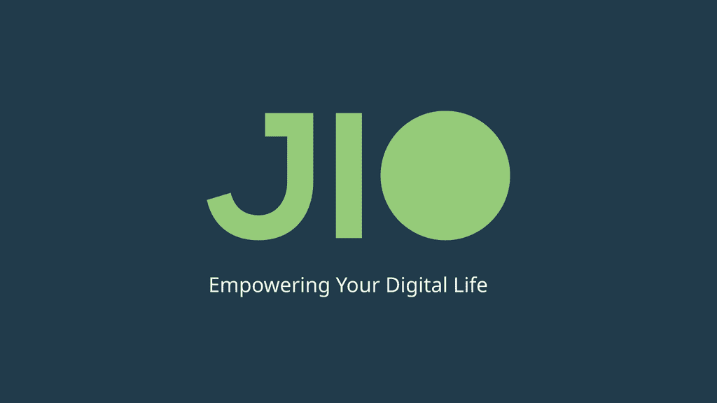
Here, "IO" represents the digital code. In digital code, all data is written in binary, which is represented by a zero and a one (0 and 1).
The Jio logo is sophisticated, minimal, classic, and timeless. The IO in the logo depicts 10 as the binary code for digital language. Which shows that Jio is empowering the digital life for everyone.
Design Process
-
Research and Inspiration
The foundation of any successful rebranding project lies in deep research. Understanding Jio’s brand ethos, market positioning, and target demographics was crucial. I delved into:
• Brand Values: Examining Jio's core principles—innovation, accessibility, and connectivity.
• Market Analysis: Studying competitors and global telecom branding trends.
• Customer Insights: Gathering feedback from Jio’s diverse user base to understand their perceptions and aspirations.
-
Concept Development
With a clear understanding of the brand and its audience, I began the conceptual phase. This involved:
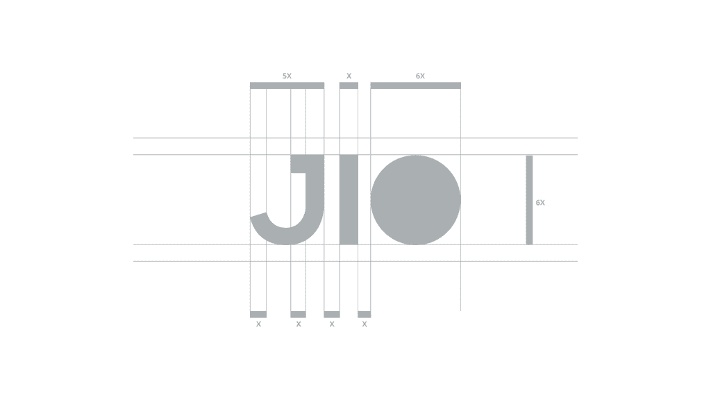
• Sketching Ideas: Brainstorming and sketching multiple logo concepts, focusing on simplicity and symbolism.
• Mood Boards: Creating visual mood boards to capture the desired look and feel—dynamic, modern, and approachable.
• Iteration: Refining selected concepts based on feedback from peers and mentors.
-
Color Palette
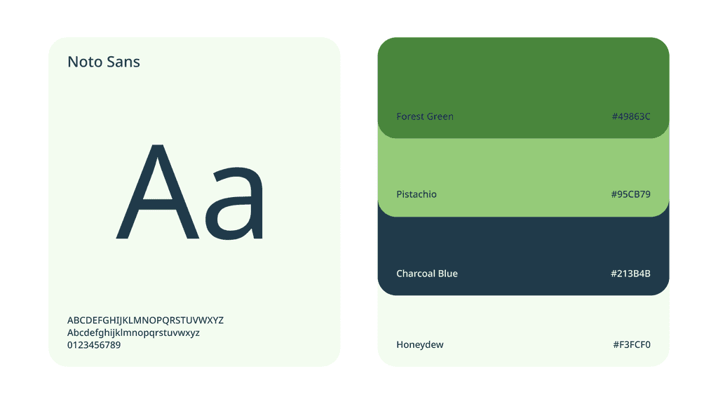
Color is a powerful tool in branding, influencing emotions and perceptions. For Jio:
• Primary Colors: I chose a vibrant blue and energetic orange. Blue symbolizes trust, reliability, and technology, while orange represents energy, creativity, and enthusiasm.
• Complementary Shades: Subtle shades were added to maintain visual harmony and versatility across different media.
-
Typography
Typography plays a crucial role in brand communication. I selected:
• Sans-Serif Typeface: A clean, modern sans-serif font that is easy to read and versatile across digital and print platforms.
• Consistency: Ensuring consistency in font usage across all brand materials to maintain a cohesive visual identity.
-
Logo Design
The logo is the cornerstone of any brand identity. The final Jio logo design process included:
• Symbolism: A circular shape to represent unity and inclusivity, with dynamic lines inside to denote speed and innovation.
• Simplicity: A design that is easily recognizable and versatile across various applications.
• Modern Aesthetics: Combining traditional elements with contemporary design trends to create a timeless yet forward-thinking logo.
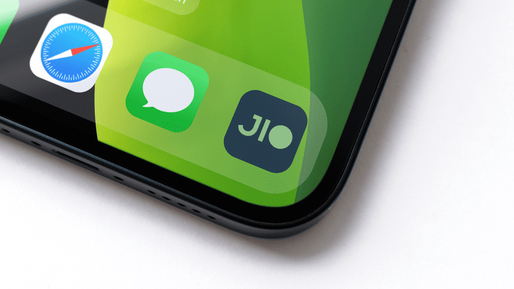
The New Jio Brand Identity
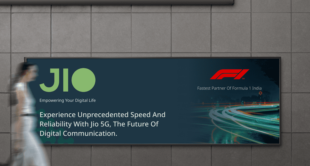
Logo The new Jio logo is more than just a visual mark; it’s a representation of Jio’s commitment to connecting people and fostering innovation. The circular design signifies global connectivity and inclusiveness, while the dynamic lines inside the circle reflect the speed and cutting-edge technology Jio brings to its users.
Design Philosophy and Challenges
Every design journey comes with its unique challenges and learning experiences. Some of the key aspects I focused on included:
• Balancing Tradition with Modernity: Ensuring the new design respects Jio’s established brand heritage while positioning it for future growth.
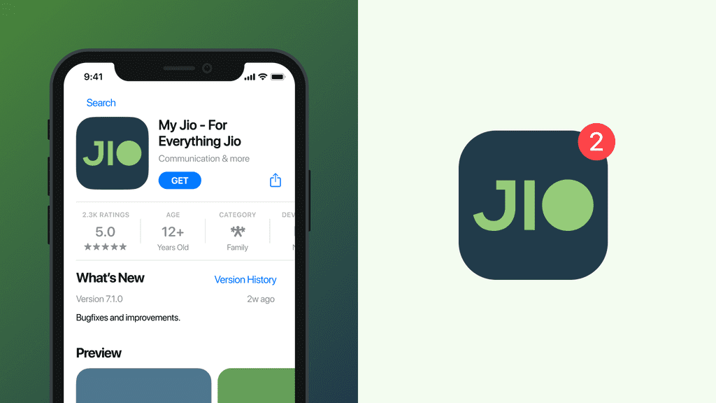
• Scalability and Versatility: Creating a logo that maintains its integrity and impact across various sizes and platforms.
• User-Centric Design: Keeping the end-user in mind, ensuring the design is approachable, relatable, and engaging for Jio’s diverse audience.
Conclusion
Rebranding Jio was an enriching and exhilarating experience. The new logo and brand identity not only reflect Jio’s core values but also set the stage for its future endeavors in the digital age. This project is a testament to the power of thoughtful design and its ability to transform perceptions and connect with people on a deeper level.
I believe in the continuous improvement and power of collaborative creativity. I welcome your feedback and look forward to potential collaborations. Together, we can create designs that not only look great but also inspire and connect. Thank you for taking the time to explore the journey of Jio’s rebranding. I hope this project resonates with you as much as it did with me. Stay tuned for more insights and projects!
Explore the Full Project on Behance
Connect with me on - Twitter | Linkedin | GitHub | Behance | Dribbble
Visit my Website to know more about me.