"Flexing with STYLE"
Introduction:
In modern web design, layout techniques are essential to creating responsive, flexible, and visually appealing websites. One of the most powerful layout tools in CSS is Flexbox (Flexible Box Layout), introduced as a one-dimensional layout model to align and distribute space within a container. This model significantly simplifies the process of arranging elements on a page.
In this blog, we'll dive deep into Flexbox, understanding its fundamental concepts and properties, and work through practical examples.
Exercise code in this post are in included for easy to understanding of the concepts.
What is Flexbox?:
Flexbox is a layout model designed to improve the arrangement and alignment of items in a container. Unlike traditional layouts that require floats or complex calculations with widths and margins, Flexbox allows elements to adapt dynamically to the size of their container. This makes it ideal for creating responsive designs where items can adjust automatically based on the screen size or container space.
Key characteristics of Flexbox:
- One-dimensional layout: Flexbox deals with layouts in one dimension at a time — either as rows or columns.
- Flexibility: Elements inside a flex container can grow, shrink, and adjust according to the container's available space.
- Alignment: Flexbox makes it easy to center elements horizontally and vertically.
Flexbox Terminology:
Before diving into properties, it's crucial to understand the terminology used in Flexbox:
- Flex container: The parent element that contains the flex items.
- Flex items: The child elements of the flex container.
- Main axis: The primary axis of the flex container (either horizontal or vertical, depending on flex-direction).
- Cross axis: The axis perpendicular to the main axis.
Basic Flexbox Properties:
There are two sets of properties in Flexbox:
- Container properties: These apply to the parent (flex container) and dictate the behaviour of the flex items inside it.
- Item properties: These apply to the flex items and control how they behave within the flex container.
Container Properties:
1) display: flex;
The first step to using Flexbox is to define the parent container as a flex container. This is done by applying the display: flex; property.
<div class="container">
    <div class="item">Item 1</div>
    <div class="item">Item 2</div>
    <div class="item">Item 3</div>
    <div class="item">Card 4</div>
</div>


/* below is CSS code */
/* this can be added as external css code or internal css as <style> */

<style>
.container {
    display: flex;
}
.item {
    padding: 20px;
    background-color: #74EE15;
    margin: 10px;
}
</style>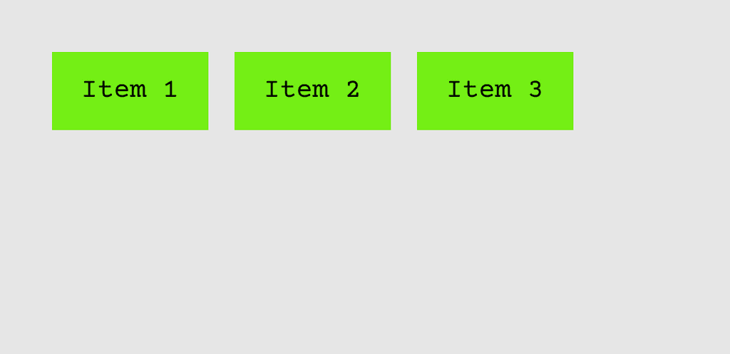
Here, by setting display: flex; we made .container a flex container, and its child elements (.item) will now behave as flex items. As a result, the items align themselves in a row (default behaviour).
2) flex-direction
The flex-direction property defines the direction of the main axis. It can be set to the following values:
row: Default. Items are aligned in a horizontal row.row-reverse: Items are aligned in reverse horizontal order.column: Items are aligned vertically in a column.column-reverse: Items are aligned in reverse vertical order.
<style>
.container {
    display: flex;
    flex-direction: column;
}
</style>
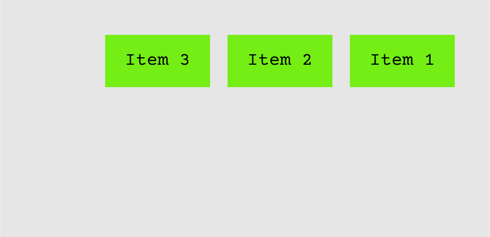
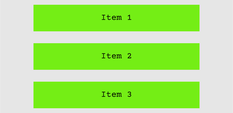
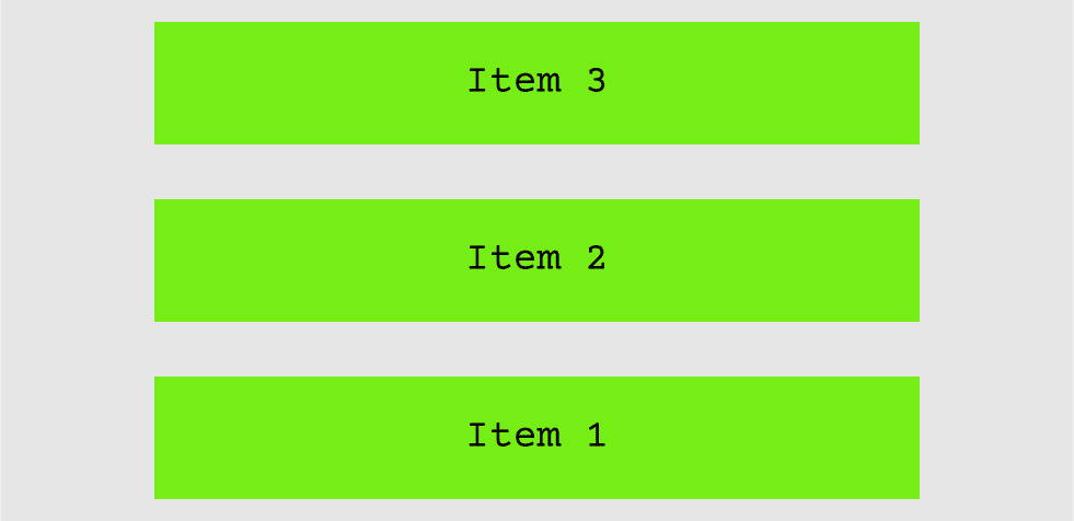
In this example, the flex items stack vertically because we set flex-direction: column.
3) justify-content
The justify-content property aligns items along the main axis (horizontal by default).
Values:
flex-start: Items are aligned at the start of the container (default).flex-end: Items are aligned at the end of the container.center: Items are centered along the main axis.space-between: Items are spaced evenly, with the first item at the start and the last item at the end.space-around: Items are spaced evenly, with equal space around them.space-evenly: Items are distributed so that the spacing between any two items (and the space to the edges) is equal.
<style>
.container {
    display: flex;
    justify-content: space-between;
}
</style>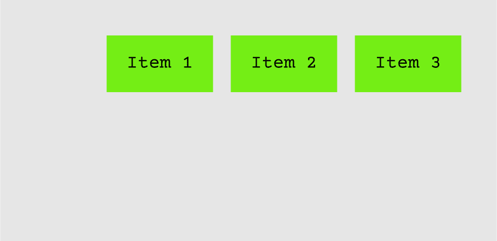
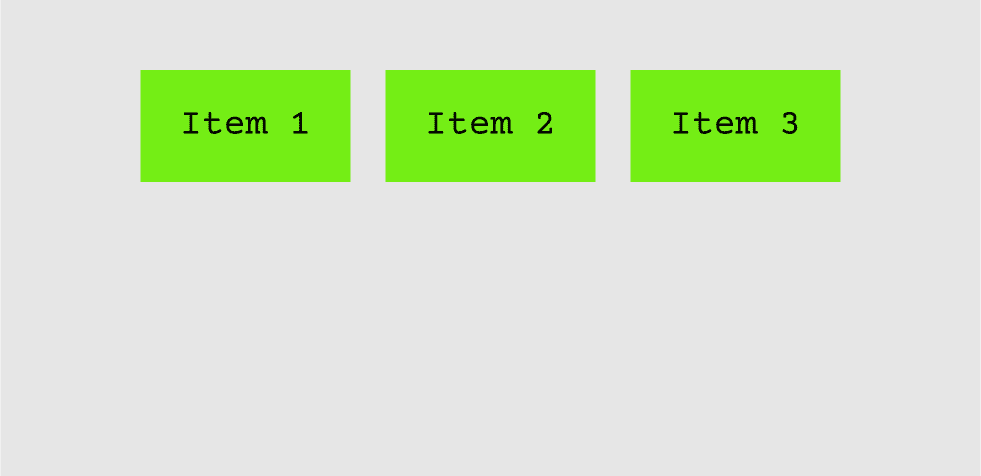
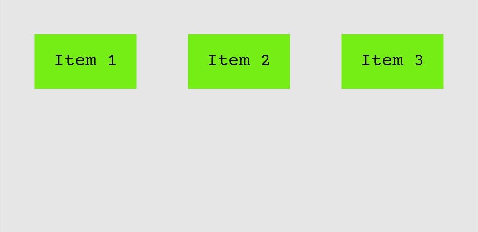
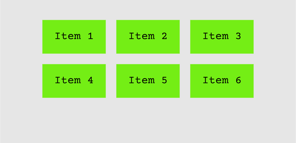
With justify-content: space-between; the items will be spaced evenly across the row, leaving equal gaps between them.
4) align-items
The align-items property controls the alignment of flex items along the cross-axis (vertical axis by default).
Values:
stretch: Stretches items to fill the container (default).flex-start: Items are aligned at the start of the container's cross-axis.flex-end: Items are aligned at the end of the cross-axis.center: Items are centered along the cross-axis.baseline: Items are aligned according to their baselines.
<style>
.container {
    display: flex;
    align-items: center;
}
</style>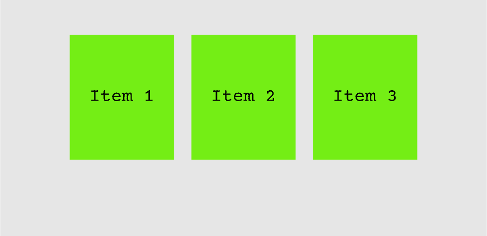
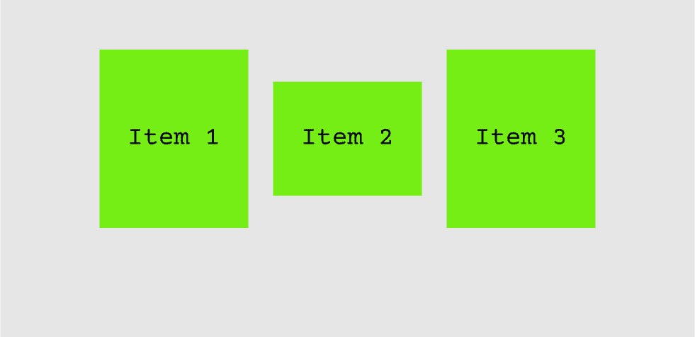
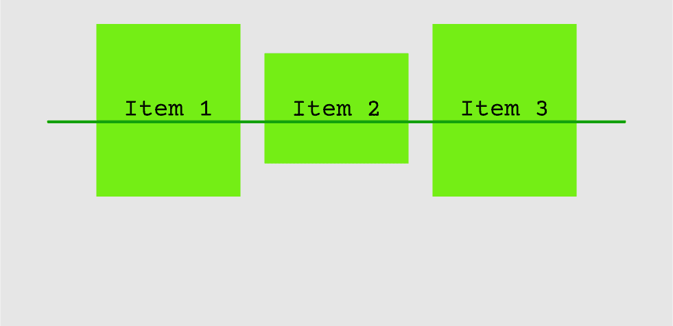
In this example, align-items: center; aligns the items vertically in the middle of the container.
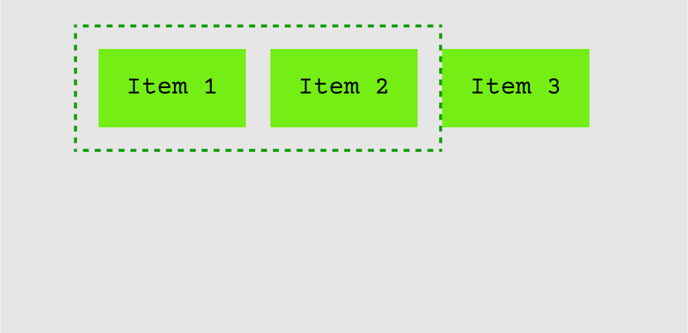
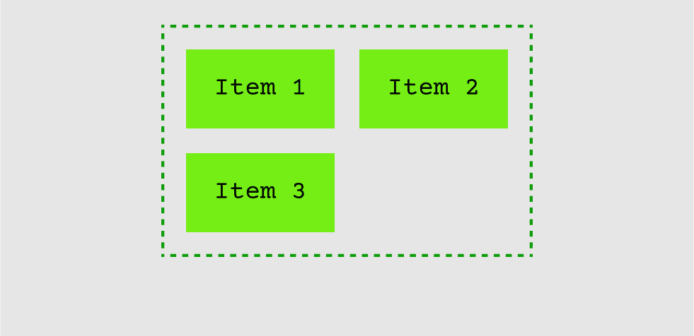
5) flex-wrap
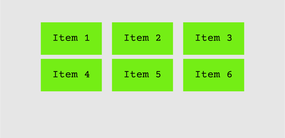
By default, Flexbox tries to fit all items into a single line. If there are too many items to fit, they shrink to fit the available space. The flex-wrap property allows items to wrap onto multiple lines if needed.
Values:
nowrap: All items are on one line (default).wrap: Items wrap onto multiple lines.wrap-reverse: Items wrap onto multiple lines in reverse order.
<style>
.container {
    display: flex;
    flex-wrap: wrap;
}
</style>
Setting flex-wrap: wrap; lets the items wrap into a new line when the container width is too narrow to fit them all.

Item Properties:
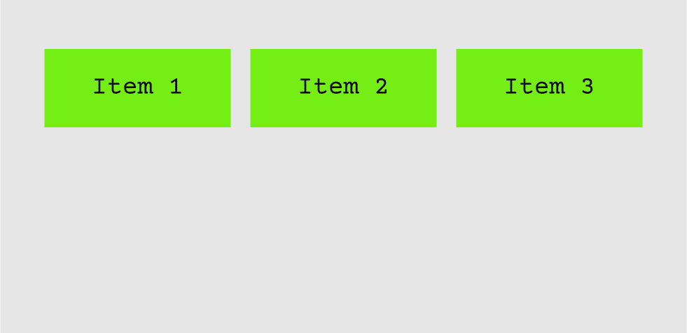
1) flex-grow
The flex-grow property allows flex items to grow and take up extra space in the container. A value of 1 means the item will grow to fill available space, while 0 means the item will not grow.
<style>
.item {
    flex-grow: 1;
}
</style>
In this case, all .item elements will grow equally to fill the remaining space in the container.

2) flex-shrink
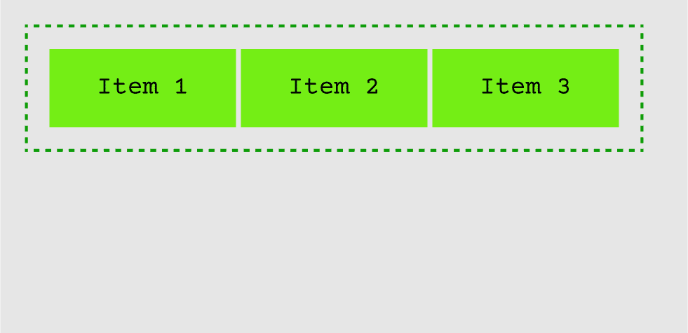
The flex-shrink property controls how much a flex item should shrink if there's not enough space in the container. A value of 1 means the item will shrink to fit, while 0 means the item will not shrink.
<style>
.item {
    flex-shrink: 1;
}
</style>
With flex-shrink: 1; the items will shrink proportionally when the container is too small.

3) flex-basis
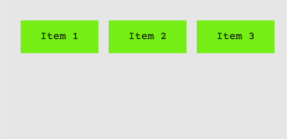
The flex-basis property defines the default size of a flex item before any space distribution occurs. It's like setting a width or height but within the Flexbox context.
<style>
.item {
    flex-basis: 200px;
}
</style>
Here, all items will start with a width of 200px before any growing or shrinking is applied.

4) align-self
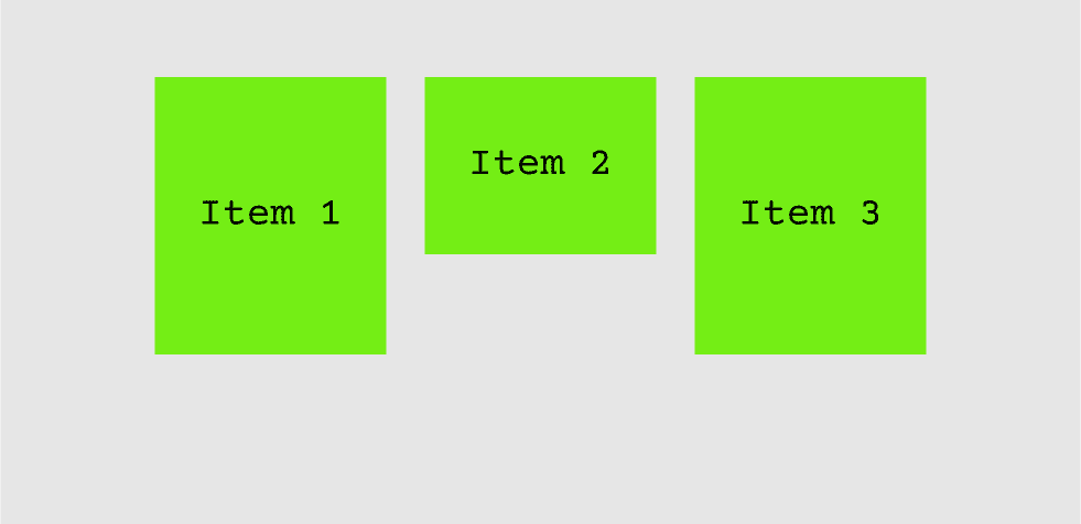
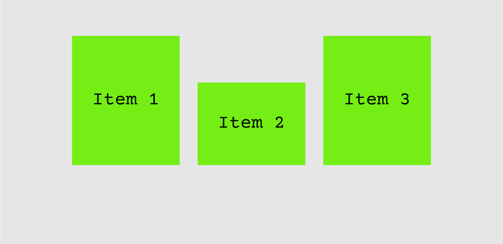
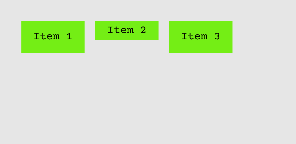
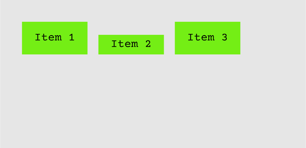
The align-self property allows individual items to override the align-items property of the container. Each item can have a unique alignment along the cross-axis.
Values:
stretch: Stretches items to fill the container (default).start: Items are aligned at the start of the container's cross-axis.end: Items are aligned at the end of the cross-axis.center: Items are centered along the cross-axis.
<style>
.item:nth-child(2) {
    align-self: flex-end;
}
</style>
This will align the second item to the end of the container, while the other items follow the container's alignment rules.


Example: Building a Responsive Card Layout
Let's apply everything we've learned so far to create a responsive card layout using Flexbox.
<div class="card-container">
    <div class="item">Item 1</div>
    <div class="item">Item 2</div>
    <div class="item">Item 3</div>
    <div class="item">Item 4</div>
</div>

<style>
.card-container {
    display: flex;
    flex-wrap: wrap;
    justify-content: space-around;
}

.item {
    background-color: #74EE15;
    padding: 20px;
    margin: 10px;
    flex-basis: 200px;
    text-align: center;
    border-radius: 8px;
}
</style>
In this example:
- We made the
.card-containera flex container. - We used
flex-wrapto ensure the cards wrap onto new lines as needed. - Each card has a
flex-basisof200px, meaning they will start with that width but can shrink or grow based on the available space. - The
justify-content: space-around;ensures the cards are evenly spaced. - This layout will automatically adapt to different screen sizes, making it a great tool for responsive design.
Conclusion:
CSS Flexbox is a powerful tool for creating flexible, responsive layouts without the hassle of complex CSS hacks or JavaScript calculations. Whether you need to align items, create responsive grids, or distribute space dynamically, Flexbox makes it simple and efficient.
In this blog, we covered the core concepts and properties of Flexbox, along with examples of how to apply them. With practice, Flexbox can become an invaluable tool in your web development toolkit for creating user-friendly, modern layouts.
Connect with me on - Twitter | Linkedin | GitHub | Behance | Dribbble
Visit my Website to know more about me.